


CSS Grid is a powerful layout system in CSS that allows you to create two-dimensional layouts for web pages. It provides a grid-based structure for organizing and positioning elements on a webpage, making it easier to create responsive and flexible designs.
Properties of Grid Parent (Container) and Children(Child) are
Lets understand them one by one:
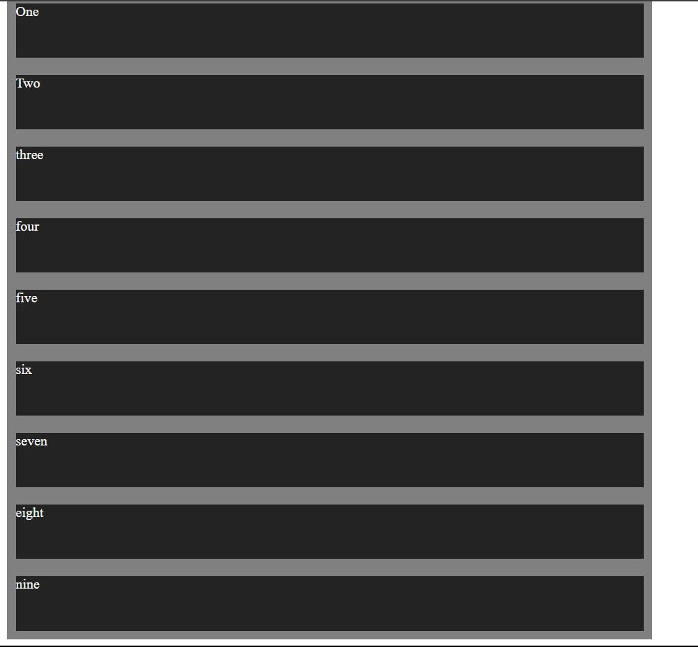
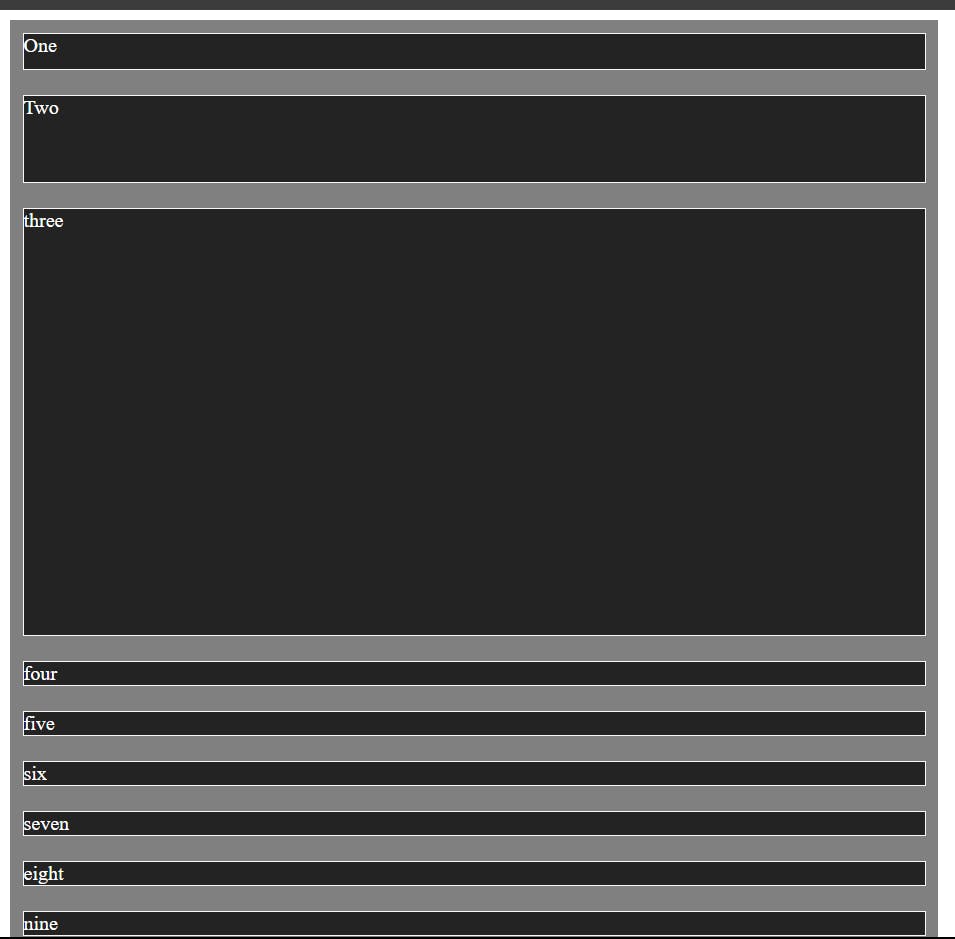
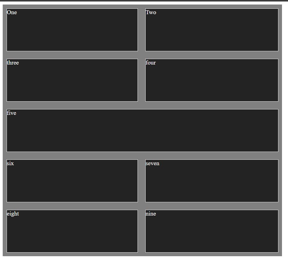
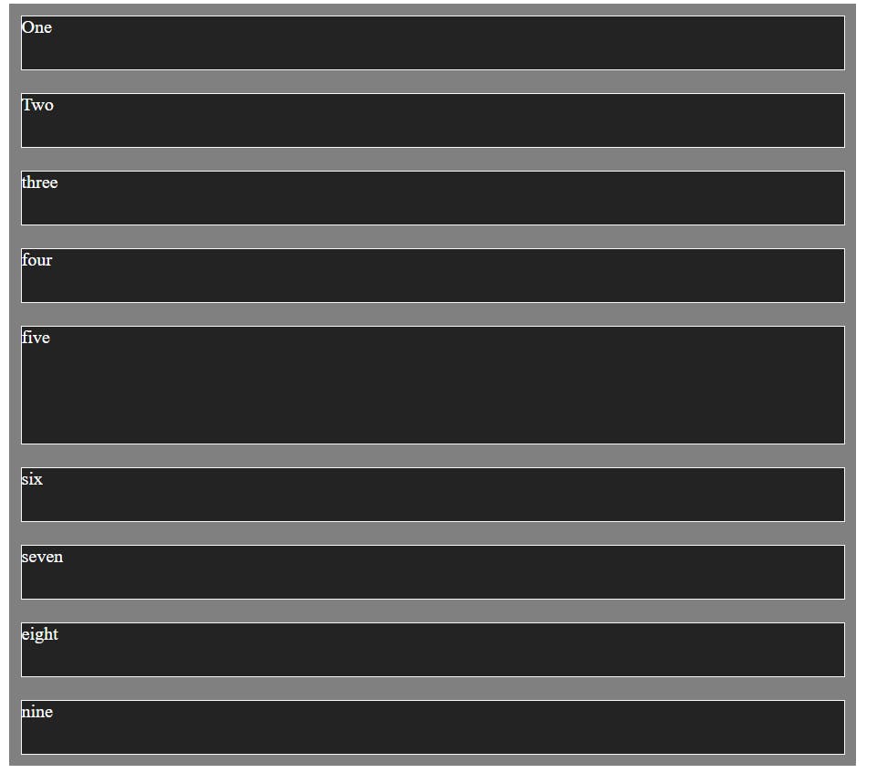
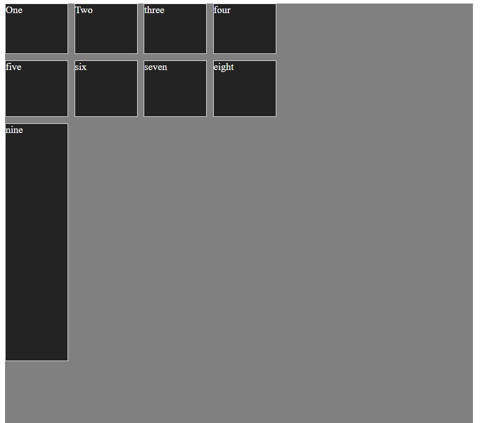
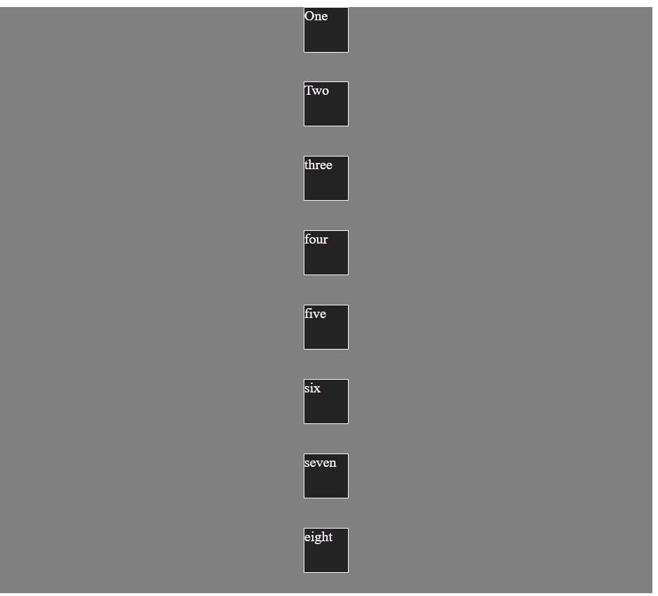
Common example for all the properties:
<!DOCTYPE html>
<html lang="en">

<head>
 <meta charset="UTF-8">
 <meta name="viewport" content="width=device-width, initial-scale=1.0">
 <title>Document</title>
 <style>
  .container {
   background-color: #808080;
   height: 100vh;
   width: 100vh;
   display: grid;
   color: white;
  }

  .box {
   background-color: #242323;
   /* height: 70px; width: 70px; */
   margin: 10px;
  }
 </style>
</head>

<body>
 <div class="container">
  <div class="box">One</div>
  <div class="box">Two</div>
  <div class="box">three</div>
  <div class="box">four</div>
  <div class="box">five</div>
  <div class="box">six</div>
  <div class="box">seven</div>
  <div class="box">eight</div>
  <div class="box">nine</div>
 </div>
</body>

</html>
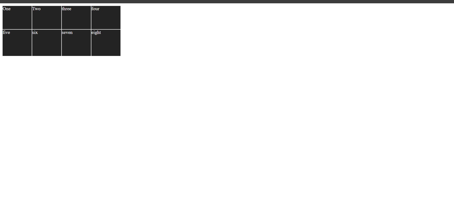
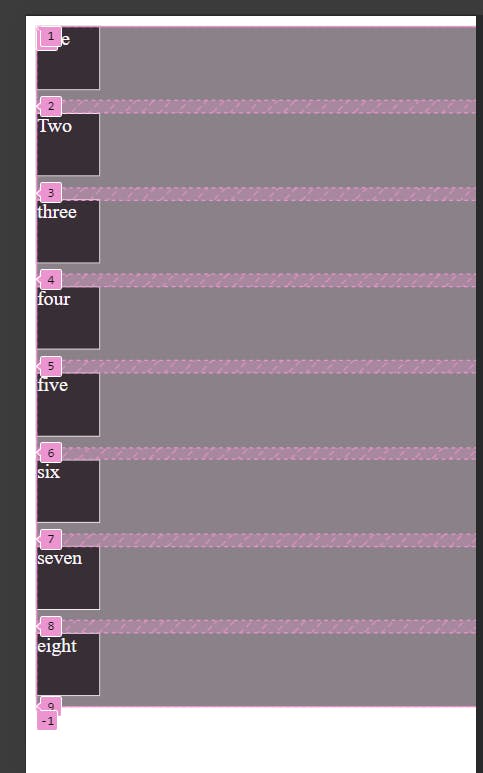
1)grid-template-columns
In CSS Grid, grid-template-columns is a property that allows us to define the number of columns and their sizes within a grid container. It gives us control over the layout of your grid in terms of column width.
.Container{
 background-color: #808080;
 height: 100vh;
 width: 100vh; display:
 grid; color: white;
 grid-template-columns:200px;
}
We can give only one value in grid-template-columns or it depends on the numbers of column we want and value can be in pixel , em , percentage or in fr.
.Container{
 background-color: #808080;
 height: 100vh;
 width: 100vh; d
 isplay: grid; color: white; grid-template-columns:200px 200px 200px;
}
we can also use different kinds of value together:
.Container{
 background-color: #808080;
 height: 100vh; width: 100vh;
 display: grid; color: white;
<!-- grid-template-columns: 200px 200px 200px; -->
<!-- grid-template-columns: 1fr 2fr 4fr; -->
<!-- grid-template-columns: 100em; --> <!-- grid-template-columns: 100px 1fr; -->
<!-- grid-template-columns: repeat(3, 1fr 150px); -->
}
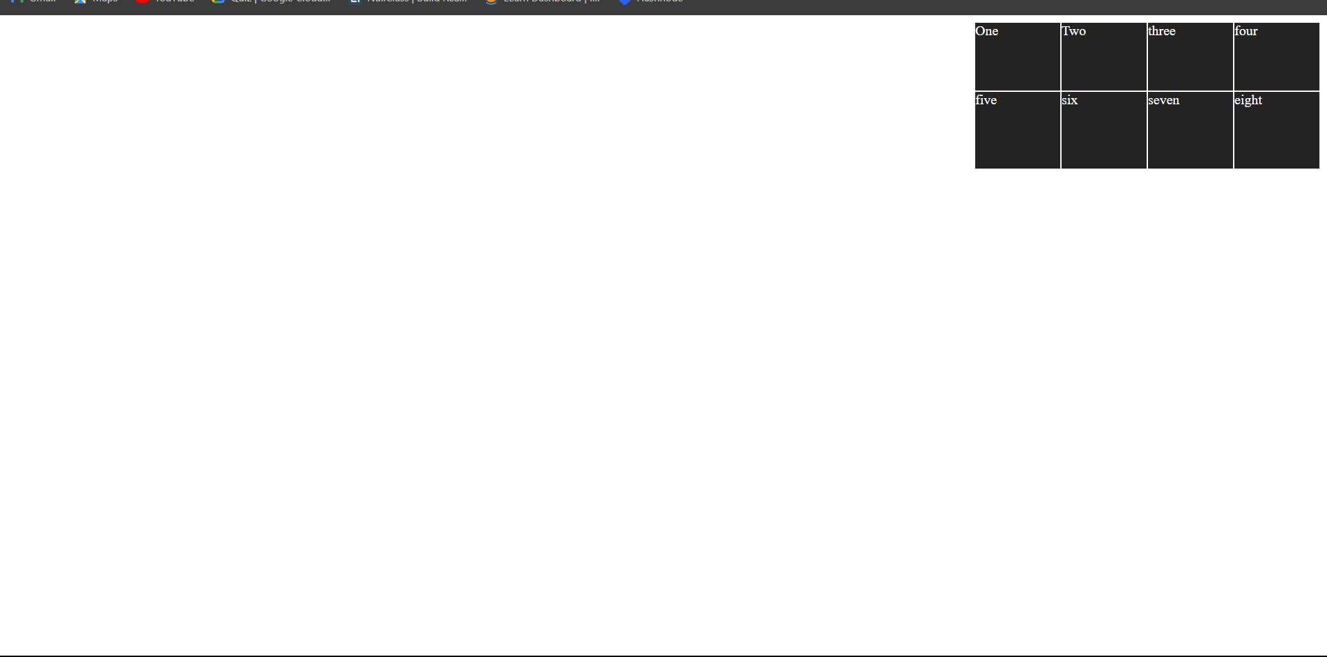
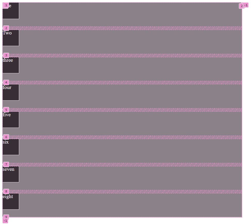
2)grid-template-rows
In CSS Grid, grid-template-rows is a property that allows us to define the number of rows and their sizes within a grid container. Much like grid-template-columns, it gives us control over the layout of our grid in terms of row heights.
.Container{
    background-color: #808080;
    height: 100vh; width: 100vh;
    display: grid; color: white;
    grid-template-rows:50px 90px 1fr;
   }
.Container{
  background-color: #808080;
  height: 100vh; width: 100vh;
  display: grid; color: white;
  grid-template-rows:inmax(200px, 2fr) 80px;
 }

like grid-template-column here also we can give different kinds of values like,
.Container{
   background-color: #808080;
   height: 100vh; width: 100vh;
   display: grid; color: white;
   <!-- grid-template-rows: 100px 200px 1fr; -->
   <!-- grid-template-rows: minmax(200px, 2fr) 80px; -->
   <!-- grid-template-rows: repeat(4, auto) 100px repeat(5, auto); -->
   <!-- grid-template-rows: 1fr 2fr 1fr; -->
   <!-- grid-template-rows: 20% 100px 3em; -->
   <!-- grid-template-rows: repeat(3, 1fr 100px); -->
 }
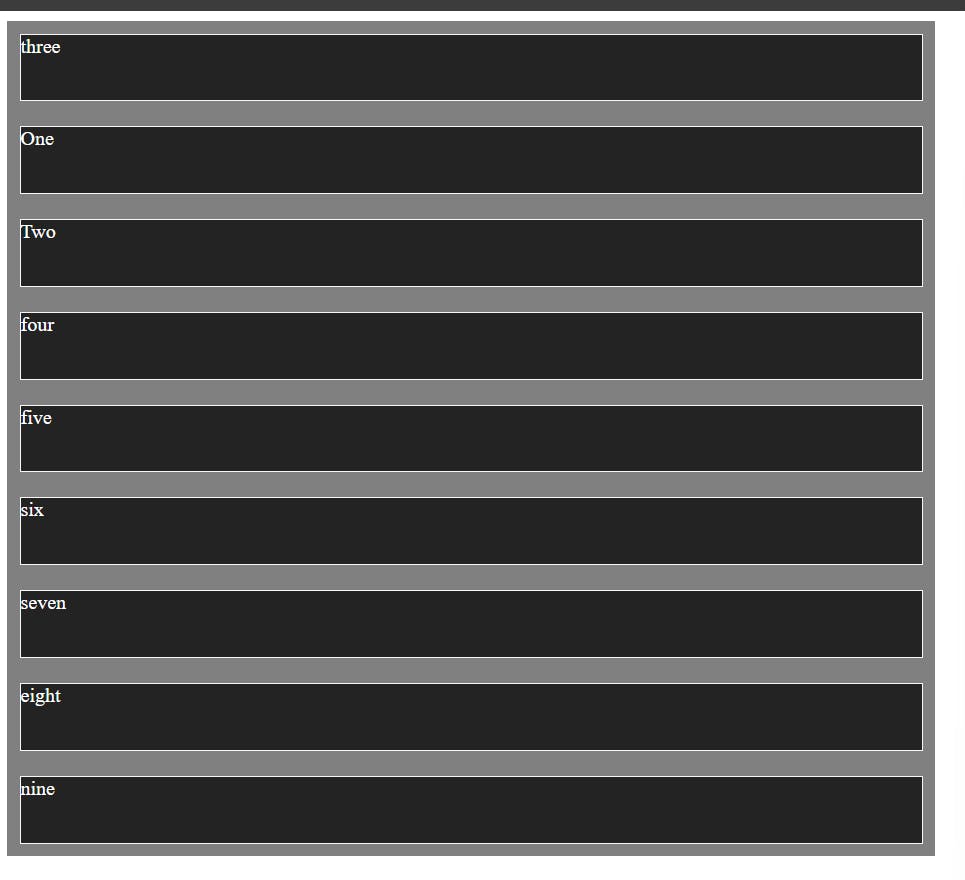
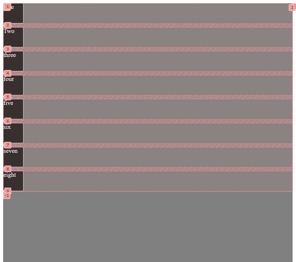
3)grid-column-start
It is a CSS property used in CSS Grid to specify the start position of a grid item within the grid columns. It defines at which vertical grid line the grid item should start and we will use this property on the items of the container or children not on the parent.
General syntax:
grid-column-start:line|span|auto;
lets understand through the example:
i)Auto: Auto is an default setting. The grid item starts at the next available grid line.
.box{
     background-color: #242323;
     /* height: 70px; width: 70px; */
      margin: 10px;
      border: hsl(0, 18%, 97%) solid 1px;
      grid-column-start:auto;
     }

ii)Line: Specifies the line number where the grid item should start.
.box{
       background-color: #242323;
      /* height: 70px; width: 70px; */
       margin: 10px;
       border: hsl(0, 18%, 97%) solid 1px;
       grid-column-start:9;

     }

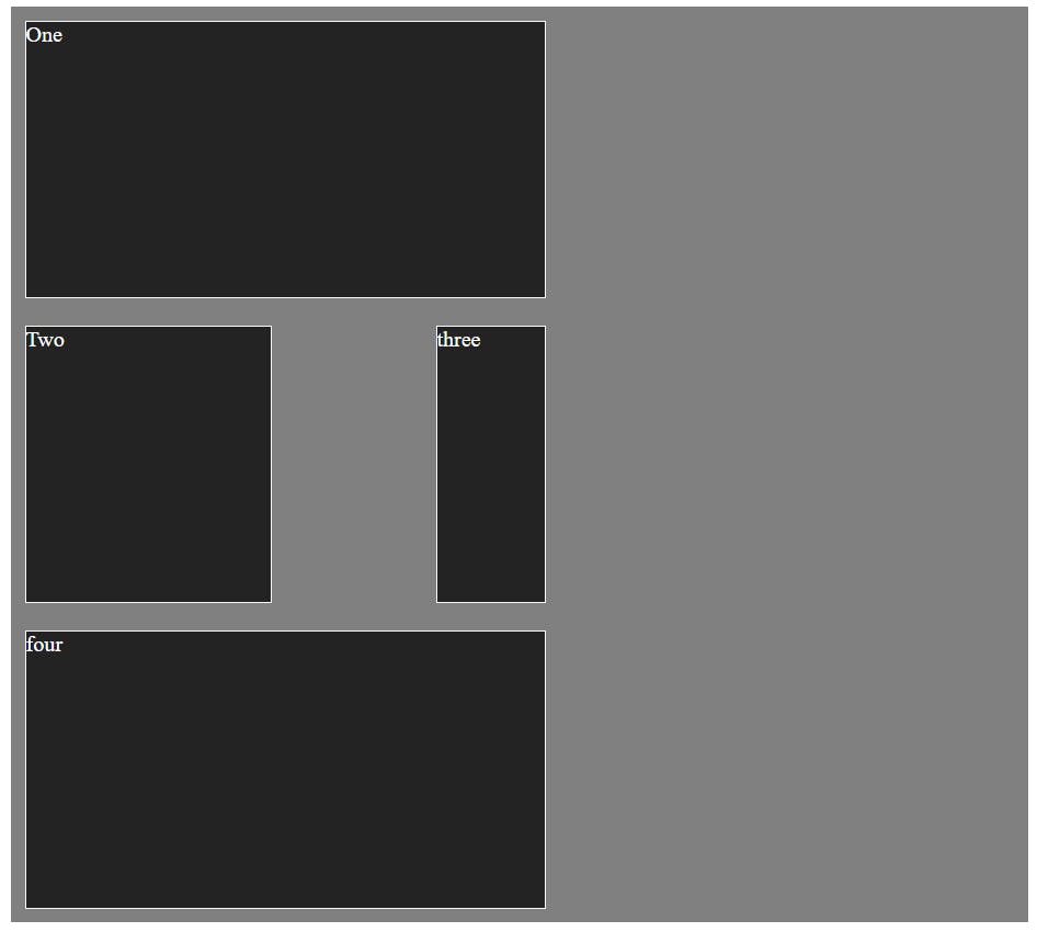
iii) Span: Specifies the number of grid columns the item should span.
.box:nth-child(3) {
 grid-column-start: span 5;
}

4)grid-column-end
This property in CSS Grid specifies the end position of a grid item along the grid's horizontal axis. It determines at which vertical grid line the grid item should end.
General Syntax
grid-column-end: <line>|span|auto;
i)line : This specifies the line number where the grid item should end.
.box{
     background-color: #242323;
     /* height: 70px; width: 70px; */
     margin: 10px;
     border: hsl(0, 18%, 97%) solid 1px;
     grid-column-end:5;

}

ii)Span: This Specifies the number of grid columns the item should span.
.box:nth-child(5) {
   grid-column-end:span 2;
 }
iii)Auto: This is default value. The grid item ends at the next available grid line.
.box{

  background-color: #242323;
  /* height: 70px;
  width: 70px;
  */ margin: 10px; border: hsl(0, 18%, 97%) solid 1px;
   grid-column-end:auto;

  }

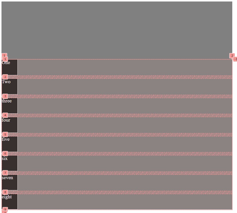
5)grid-row-start
This property in CSS Grid Layout specifies the starting position of a grid item along the grid's vertical axis. It defines at which horizontal grid line the grid item should start.
general syntax:
grid-row-start: <line>|span|auto;
line: This specifies the line number where the grid item should start
.box{

     background-color: #242323;
     /* height: 70px;
     width: 70px;
     */ margin: 10px;
     border: hsl(0, 18%, 97%) solid 1px; /*
      grid-column-end:auto;
       */ grid-row-start: 3;

      }
span: This specifies the number of grid rows the item should span.
.box:nth-child(5) {

     grid-row-start: span 3;

 }
Auto: This is Default value. The grid item starts at the next available grid line.
.box{

   background-color: #242323;
   /* height: 70px; width: 70px;
   */ margin: 10px;
    border: hsl(0, 18%, 97%) solid 1px;
    /*
    grid-column-end:auto; */
    /* grid-row-start: 3; */
    grid-row-start: auto;
}

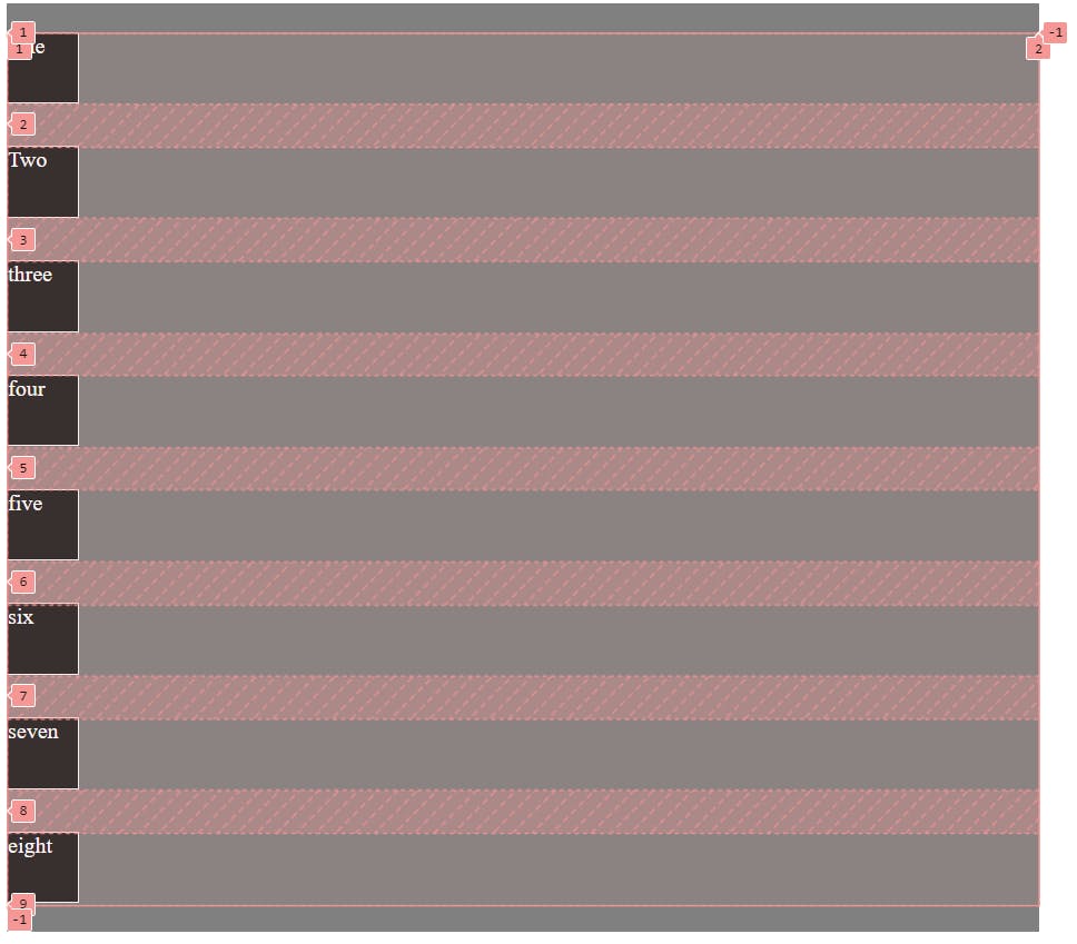
6)grid-row-end
This property in CSS Grid specifies the end position of a grid item along the grid's vertical axis, indicating which grid line the item should end at.
general syntax:
grid-row-end: <line>|span|auto;
i) Line: This specifies the line number where the grid item should end.
.box{
 background-color: #242323;
 /* height: 70px; width: 70px;
  */ margin: 10px;
  border: hsl(0, 18%, 97%) solid 1px; /*
   grid-column-start:auto;
 */
  grid-row-end:5;

}
ii)Span: This specifies the number of grid columns the item should span.
.box:nth-child(3) {

 grid-row-end:1;

}
As we can see above third box has gone up on the 1st box

ii)span: This specifies the number of grid rows the item should span.
.box:nth-child(3) {

  grid-row-end: span 15;

 }

iii)Auto :It is default value. The grid item ends at the next available grid line.
box{
    background-color: #242323;
    /* height: 70px; width: 70px; */
     margin: 10px; b
     order: hsl(0, 18%, 97%) solid 1px; /*
     grid-column-start:auto; */
     grid-row-end:auto;
 }

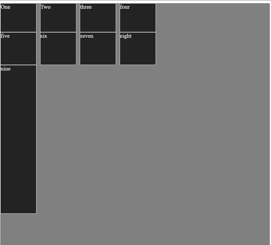
7)grid-template-areas
In HTML and CSS, you might use classes or IDs to style each of these sections separately. But in CSS Grid, you can define these sections more visually and intuitively using the grid-template-areas property.
Most important things to remember:
a)The number of area names in each row must match the number of columns in the grid.
b)Each row must have the same number of area names.
c)Areas can span multiple columns or rows by repeating the area name or using a period (.) to create empty cells.
.container{
      background-color: #808080;
      height: 90vh; width: 100vh;
      display: grid; color: white;
      grid-template-columns:
      100px 100px 100px 100px 100px;
      grid-template-rows: auto;
      grid-template-areas: "header header header header"
      "main main .sidebar"
      "footer footer footer footer";
}

.first{

 grid-area: header;

}

.second{

  grid-area: main;

  }
  .third{

   grid-area:sidebar;

   }
.fourth{

 grid-area: footer;

}

<body>
 <div class="container">
  <div class="box first">One</div>
  <div class="box second">Two</div>
  <div class="box third">three</div>
  <div class="box fourth">four</div>
 </div>
</body>
8)column-gap/grid-column-gap
This property specifies the size of the gap between columns in the grid. It accepts values in various units such as pixels, percentages, or other length units. By setting column-gap, you can create consistent spacing between columns throughout the grid layout.
.container{
            background-color: #808080;
            height: 90vh;
            width: 100vh;
            display: grid;
            color: white;
            grid-template-columns: 100px 100px 100px 100px ;
            grid-template-rows: 80px 90px auto 90px;
            column-gap: 10px;

}
9)row-gap/grid-row-gap
The row-gap property in CSS Grid is used to specify the size of the gap or spacing between rows in the grid. It allows you to control the vertical spacing between the rows, providing consistency and alignment in your grid layout.
.container{
            background-color: #808080;
            height: 90vh;
            width: 100vh;
            display: grid;
            color: white;
            grid-template-columns: 100px 100px 100px 100px ;
            grid-template-rows: 80px 90px auto 90px;
            column-gap: 10px;
            row-gap: 10px;
           }
10)Gap/grid gap
The grid-gap property in CSS Grid Layout is a shorthand property used to specify the size of the gap or spacing between rows and columns in the grid. It allows you to set the gap between both rows and columns simultaneously, providing consistent spacing throughout the grid layout. px; */
.container
  {
            background-color: #808080;
            height: 90vh;
            width: 100vh;
            display: grid;
            color: white;
            grid-template-columns: 100px 100px 100px 100px ;
            grid-template-rows: 80px 90px auto 90px;
            /* column-gap: 10px;
            row-gap: 10px */
            gap: 40px 50px;
}

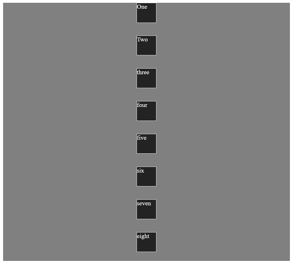
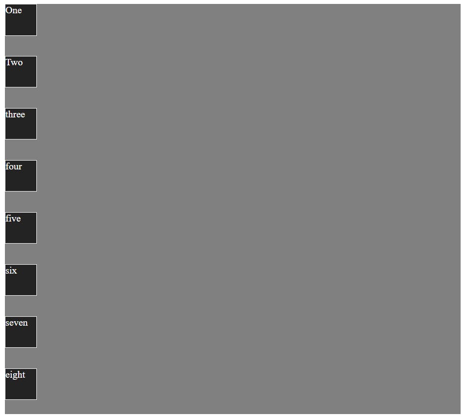
11)justify-item
The justify-items property in CSS Grid Layout is used to align grid items along the inline (horizontal) axis within their grid cells. It defines how the content of each grid item is positioned horizontally within its grid cell.
general syntax
justify-items: start | end | center | stretch;
i)start: Aligns the grid items to the start of the grid cell along the inline axis.
 .container
  {
            /* background-color: #808080; */
            /* height: 90vh;
            width: 100vh;  */
            display: grid;
            color: white;
            grid-template-columns: 100px 100px 100px 100px ;
            grid-template-rows: 80px 90px auto 90px;
            /* column-gap: 10px;
            row-gap: 10px; */
            justify-content: start;


}
ii)end: Aligns the grid items to the end of the grid cell along the inline axis.
 .container
  {
            /* background-color: #808080; */
            /* height: 90vh;
            width: 100vh;  */
            display: grid;
            color: white;
            grid-template-columns: 100px 100px 100px 100px ;
            grid-template-rows: 80px 90px auto 90px;
            /* column-gap: 10px;
            row-gap: 10px; */
            justify-content: end;


}
iii)center: Centers the grid items horizontally within the grid cell along the inline axis.
 .container
  {
            /* background-color: #808080; */
            /* height: 90vh;
            width: 100vh;  */
            display: grid;
            color: white;
            grid-template-columns: 100px 100px 100px 100px ;
            grid-template-rows: 80px 90px auto 90px;
            /* column-gap: 10px;
            row-gap: 10px; */
            justify-content: center;


}

iv)stretch: Default value. Stretches the grid items to fill the entire width of the grid cell along the inline axis.
 .container
  {
            /* background-color: #808080; */
            /* height: 90vh;
            width: 100vh;  */
            display: grid;
            color: white;
            /* grid-template-columns: 100px 100px 100px 100px ;
            grid-template-rows: 80px 90px auto 90px; */
            /* column-gap: 10px;
            row-gap: 10px; */
            justify-content: stretch;


}
12)align-items
The align-items property in CSS Grid is used to align grid items along the block (vertical) axis within their grid containers. It defines how the content of each grid item is positioned vertically within its grid cell.
general syntax
align-items: start | end | center | stretch
Start: Aligns the grid items to the start of the grid container along the block axis.
.container
  {
            background-color: #808080;
            height: 90vh;
            width: 100vh;
            display: grid;
            color: white;
            /* grid-template-columns: 100px 100px 100px 100px ;
            grid-template-rows: 80px 90px auto 90px; */
            column-gap: 10px;
            row-gap: 10px;
           /* justify-content: stretch; */
             align-items:start;

    }
end: Aligns the grid items to the end of the grid container along the block axis.
.container
 {
            background-color: #808080;
            height: 90vh;
            width: 100vh;
            display: grid;
            color: white;
            /* grid-template-columns: 100px 100px 100px 100px ;
            grid-template-rows: 80px 90px auto 90px; */
            column-gap: 10px;
            row-gap: 10px;
           /* justify-content: stretch; */
             align-items:end;

    }

center: Centers the grid items vertically within the grid container along the block axis.
.container
 {
            background-color: #808080;
            height: 90vh;
            width: 100vh;
            display: grid;
            color: white;
            /* grid-template-columns: 100px 100px 100px 100px ;
            grid-template-rows: 80px 90px auto 90px; */
            column-gap: 10px;
            row-gap: 10px;
           /* justify-content: stretch; */
             align-item: center;

    }

stretch: This is default value. Stretches the grid items to fill the entire height of the grid.
.container
 {
            background-color: #808080;
            height: 90vh;
            width: 100vh;
            display: grid;
            color: white;
            /* grid-template-columns: 100px 100px 100px 100px ;
            grid-template-rows: 80px 90px auto 90px; */
            column-gap: 10px;
            row-gap: 10px;
           /* justify-content: stretch; */
             align-items:stretch;

    }
13)justify-content
In CSS Grid, the justify-content property actually applies to the grid container, not the grid items. It's used to align the grid items along the inline (horizontal) axis when the grid container has extra space.
general syntax
justify-content: start | end | center | stretch | space-between | space-around
 | space-evenly;
i)start: Aligns grid items to the start of the grid container along the inline axis.
.container
  {
            background-color: #808080;
            height: 90vh;
            width: 100vh;
            display: grid;
            color: white;
            /* grid-template-columns: 100px 100px 100px 100px ;
            grid-template-rows: 80px 90px auto 90px; */
            column-gap: 10px;
            row-gap: 10px;
           /* justify-content: stretch; */
             /* align-items:end; */
             justify-content:start;

    }

ii) end: Aligns grid items to the end of the grid container along the inline axis.
.container
  {
            background-color: #808080;
            height: 90vh;
            width: 100vh;
            display: grid;
            color: white;
            /* grid-template-columns: 100px 100px 100px 100px ;
            grid-template-rows: 80px 90px auto 90px; */
            column-gap: 10px;
            row-gap: 10px;
           /* justify-content: stretch; */
             /* align-items:end; */
             justify-content:end;

    }

iii)center: Centers grid items horizontally within the grid container along the inline axis.
.container
  {
            background-color: #808080;
            height: 90vh;
            width: 100vh;
            display: grid;
            color: white;
            /* grid-template-columns: 100px 100px 100px 100px ;
            grid-template-rows: 80px 90px auto 90px; */
            column-gap: 10px;
            row-gap: 10px;
           /* justify-content: stretch; */
             /* align-items:end; */
             justify-content:center;

    }
iv)stretch: Default value. Stretches grid items to fill the entire width of the grid container along the inline axis.
.container
  {
            background-color: #808080;
            height: 90vh;
            width: 100vh;
            display: grid;
            color: white;
            /* grid-template-columns: 100px 100px 100px 100px ;
            grid-template-rows: 80px 90px auto 90px; */
            column-gap: 10px;
            row-gap: 10px;
           /* justify-content: stretch; */
             /* align-items:end; */
             justify-content:stretch;

    }
v)space-between: Distributes grid items evenly along the inline axis, with the first item at the start edge and the last item at the end edge.
.container
  {
            background-color: #808080;
            height: 90vh;
            width: 100vh;
            display: grid;
            color: white;
            /* grid-template-columns: 100px 100px 100px 100px ;
            grid-template-rows: 80px 90px auto 90px; */
            column-gap: 10px;
            row-gap: 10px;
           /* justify-content: stretch; */
             /* align-items:end; */
             justify-content:space-between;

    }

vi)space-around: Distributes grid items evenly along the inline axis, with equal space around them.
.container
  {
            background-color: #808080;
            height: 90vh;
            width: 100vh;
            display: grid;
            color: white;
            /* grid-template-columns: 100px 100px 100px 100px ;
            grid-template-rows: 80px 90px auto 90px; */
            column-gap: 10px;
            row-gap: 10px;
           /* justify-content: stretch; */
             /* align-items:end; */
             justify-content:space-around;

    }

vii)space-evenly: Distributes grid items evenly along the inline axis, with equal space between and around them.
.container
  {
            background-color: #808080;
            height: 90vh;
            width: 100vh;
            display: grid;
            color: white;
            /* grid-template-columns: 100px 100px 100px 100px ;
            grid-template-rows: 80px 90px auto 90px; */
            column-gap: 10px;
            row-gap: 10px;
           /* justify-content: stretch; */
             /* align-items:end; */
             justify-content:start;

    }
14)align-content
This property is used to align the grid tracks (rows) within the grid container along the block (vertical) axis when there is extra space available. This property comes into play when there's more space in the block direction than the total size of the grid tracks.
general syntax
align-content: stretch | start | end | center | space-between | space-around | space-evenly;
stretch: Default value. It stretches the grid tracks to fill the available space within the grid container along the block axis.
.container
  {
            background-color: #808080;
            height: 90vh;
            width: 100vh;
            display: grid;
            color: white;
            /* grid-template-columns: 100px 100px 100px 100px ;
            grid-template-rows: 80px 90px auto 90px; */
            column-gap: 10px;
            row-gap: 10px;
            /* justify-content: stretch; */
            /* align-items:end; */
            /* justify-content:space-between; */
            /*  */
            align-content: stretch;

    }

start: Aligns the grid tracks to the start of the grid container along the block axis.
.container
  {
            background-color: #808080;
            height: 90vh;
            width: 100vh;
            display: grid;
            color: white;
            /* grid-template-columns: 100px 100px 100px 100px ;
            grid-template-rows: 80px 90px auto 90px; */
            column-gap: 10px;
            row-gap: 10px;
            /* justify-content: stretch; */
            /* align-items:end; */
            /* justify-content:space-between; */
            /*  */
            align-content: start;

    }
end: Aligns the grid tracks to the end of the grid container along the block axis.
.container
  {
            background-color: #808080;
            height: 90vh;
            width: 100vh;
            display: grid;
            color: white;
            /* grid-template-columns: 100px 100px 100px 100px ;
            grid-template-rows: 80px 90px auto 90px; */
            column-gap: 10px;
            row-gap: 10px;
            /* justify-content: stretch; */
            /* align-items:end; */
            /* justify-content:space-between; */
            /*  */
            align-content: end;

    }
center: Centers the grid tracks within the grid container along the block axis.
.container
  {
            background-color: #808080;
            height: 90vh;
            width: 100vh;
            display: grid;
            color: white;
            /* grid-template-columns: 100px 100px 100px 100px ;
            grid-template-rows: 80px 90px auto 90px; */
            column-gap: 10px;
            row-gap: 10px;
            /* justify-content: stretch; */
            /* align-items:end; */
            /* justify-content:space-between; */
            /*  */
            align-content: center;

    }

space-between: Distributes the grid tracks evenly along the block axis, with the first track at the start edge and the last track at the end edge, and the extra space is distributed evenly between the tracks.
.container
  {
            background-color: #808080;
            height: 90vh;
            width: 100vh;
            display: grid;
            color: white;
            /* grid-template-columns: 100px 100px 100px 100px ;
            grid-template-rows: 80px 90px auto 90px; */
            column-gap: 10px;
            row-gap: 10px;
            /* justify-content: stretch; */
            /* align-items:end; */
            /* justify-content:space-between; */
            /*  */
            align-content: space-between;

    }

space-around: Distributes the grid tracks evenly along the block axis, with equal space around each track, and half of the extra space is placed before the first track and after the last track.
.container
  {
            background-color: #808080;
            height: 90vh;
            width: 100vh;
            display: grid;
            color: white;
            /* grid-template-columns: 100px 100px 100px 100px ;
            grid-template-rows: 80px 90px auto 90px; */
            column-gap: 10px;
            row-gap: 10px;
            /* justify-content: stretch; */
            /* align-items:end; */
            /* justify-content:space-between; */
            /*  */
            align-content: space-arund;

    }

space-evenly: Distributes the grid tracks evenly along the block axis, with equal space around each track, including the space before the first track and after the last track.
.container
  {
            background-color: #808080;
            height: 90vh;
            width: 100vh;
            display: grid;
            color: white;
            /* grid-template-columns: 100px 100px 100px 100px ;
            grid-template-rows: 80px 90px auto 90px; */
            column-gap: 10px;
            row-gap: 10px;
            /* justify-content: stretch; */
            /* align-items:end; */
            /* justify-content:space-between; */
            /*  */
            align-content: space-evenly;

    }
There are other properties like justify-self, align-self and place-self this properties are properties that allow you to control the alignment and positioning of individual grid items within their respective grid cells.
CSS Grid offers developers an intuitive and powerful toolset for creating modern, responsive web layouts. With its robust features and flexibility, designers can easily create complex grid structures using all these properties.
Thank you for taking the time to read this blog! Your interest and engagement are greatly appreciated. If you found this content helpful, insightful, or informative, please feel free to share it with others who might benefit from it.
cheers!!!!