


Table of contents
- Introduction Of Flex/Flexbox
- Properties Of Flex
- 1) Display
- 2) Flex Direction
- i)Row
- ii)Row Reverse
- iii)Column
- iv)Column-Reverse
- 3) Flex Wrap
- 4)Flex Flow
- 5) Justify content
- i)Flex Start
- ii)Flex End
- iii)Flex-Center
- iv)Flex-Space between
- v)flex Space-Around
- vi)Flex Space-Evenly
- 6)Align-items
- i)flex-start
- ii)Flex-end
- iii)Flex-center
- iv) flex Stretch
- v) Flex baseline
- 7)Gap, row-gap, column-gap:
Introduction Of Flex/Flexbox
Flexbox, or the Flexible Box Layout, is a layout model in CSS that allows you to design complex layouts and distribute space and align items within a container, even when the size of your items is unknown or dynamic.
It helps to get use of container's available space.
Example to explain all Properties
<body>
  <div class="Container">
    <div class="Item">One</div>
    <div class="Item" id="flex">Two</div>
    <div class="Item">Three</div>
    <div class="Item">Four</div>
    <div class="Item">Five</div>
    <div class="Item">Six</div>
    <div class="Item">Seven</div>
    <div class="Item">Eight</div>
  </div>
</body>
In Flexbox, there are two primary axes: the main axis and the cross axis.
i)Main Axis:
The main axis is the primary axis along which the flex container distributes its items. It is determined by the flex-direction property. By default, the flex-direction is set to row, so the main axis is horizontal. If you set flex-direction: column, the main axis becomes vertical.
ii)Cross Axis:
The cross axis is perpendicular to the main axis. If the main axis is horizontal, the cross axis is vertical, and vice versa. The alignment of items along the cross axis is controlled by the align-items property.
Properties Of Flex
1) Display
In CSS Flexbox, the display property is used to define a flex container. A flex container is a box that can hold flex items. The display property value for creating a flex container is flex or inline-flex.
General Syntax:
.container {

display: flex; /* or display: inline-flex; */

}
The CSS column have no effects on flex container.
2) Flex Direction
Flex direction is works on the main axis. It specifies the direction in which the flex items are placed in the flex container. The main axis is the primary axis along which the flex items are laid out.
The flex-direction property can take one of four values:
i)Row
ii)Row Reverse
iii)Column
iv)Column-Reverse
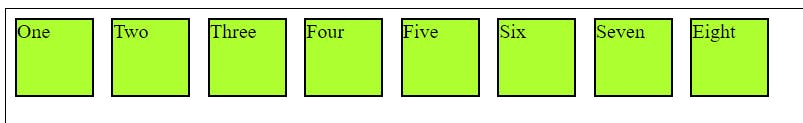
i)Row
Row in CSS, it means that things inside a box will go from left to right, like reading a book. It's the standard way for arranging items horizontally, making it easy to create layouts that flow from the left side to the right side.
.Container{
display: flex;
height: 700px;
border: 1px solid black;
flex-direction: row;
}
Output:

We can see in the above example that items ae arranged in row manner.
ii)Row Reverse
It flips the arrangement of items inside a flex container. Instead of going from left to right, they now go from right to left.
.Container{
display: flex;
height: 700px;
border: 1px solid black;
flex-direction: row-reverse;
}
Output:

Now we can see that the items are flipped , row has started from right to left.
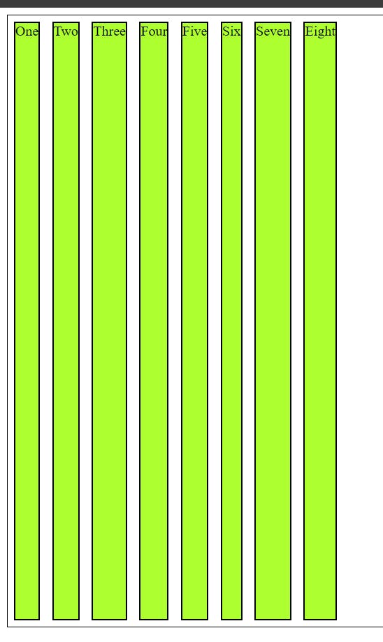
iii)Column
Column in CSS, it changes the arrangement of items inside a flex container so that they now stack vertically, from top to bottom.
.Container{
display: flex;
height: 700px;
border: 1px solid black;
flex-direction: column;
}
Output:

Items are arranged in stack like structure.
iv)Column-Reverse
In CSS, the column-reverse property is used to reverse the order of columns in a multi-column layout.
.Container{
display: flex;
height: 700px;
border: 1px solid black;
 flex-direction: column-reverse;
}
Output:

we can see that is has changed the order of the items .
3) Flex Wrap
Flex wrap is used in a flex container to control whether the flex items are forced into a single line or can be wrapped onto multiple lines.
There are three values in flex wrap:
i) wrap: Flex items will be wrap into multiple lines from top to bottom.
ii) No-wrap: It is default setting, all flex items will be in single line
iii) wrap-reverse : Flex items will be wrap into multiple lines from bottom to top.
To see whether this three properties are working are not we need to go incept in browser or make the website responsive.
General syntax :
flex-wrap:
     flex-wrap: wrap-reverse;
     flex-flow: column wrap;
     flex-wrap: wrap-reverse;
4)Flex Flow
Using Flex flow we can use all of the above properties without the actual syntax.
5) Justify content
The Justify content property is used to align items along the main axis of a flex container .It helps distribute space between and around flex items .This defines he alignment along the main axis .Justify content will work horizontally on items of container
The justify content property can take one of six values:
i)Flex Start
It is an default position of an flex items .Items are positioned toward the start of the flex-direction.
.Container{
display: flex;
height: 700px;
border: 1px solid black;
 justify-content: flex-start
}
Output:
ii)Flex End
Items are positioned toward the end of the flex-direction.
.Container{
display: flex;
height: 700px;
border: 1px solid black;
 justify-content: flex-end;
}
Output:

iii)Flex-Center
Items are positioned at the center of the line.
.Container{
display: flex;
height: 700px;
border: 1px solid black;
justify-content: center;
}
Output:

iv)Flex-Space between
The space-between means that the available space is distributed evenly between the flex items, pushing the first item to the start edge, the last item to the end edge, and creating equal space between the items.
.Container{
display: flex;
height: 700px;
border: 1px solid black;
 justify-content:space-between;
}
Output:

v)flex Space-Around
In this items are evenly distributed along the main axis with equal space around them . It adds equal amounts of space before the first item, after the last item, and between each pair of adjacent items.
.Container{
display: flex;
height: 700px;
border: 1px solid black;
 justify-content:space-around;
}
Output:

vi)Flex Space-Evenly
Items are evenly distributed along the main axis with equal space around them including before the first and after the last item.
.Container{
display: flex;
height: 700px;
border: 1px solid black;
 justify-content:space-evenly;
}

6)Align-items
Align items will work vertically on the items of the container. This works on the items of container. It is used to flex items along the cross-axis of the flex container.
The align-items property accepts the following values:
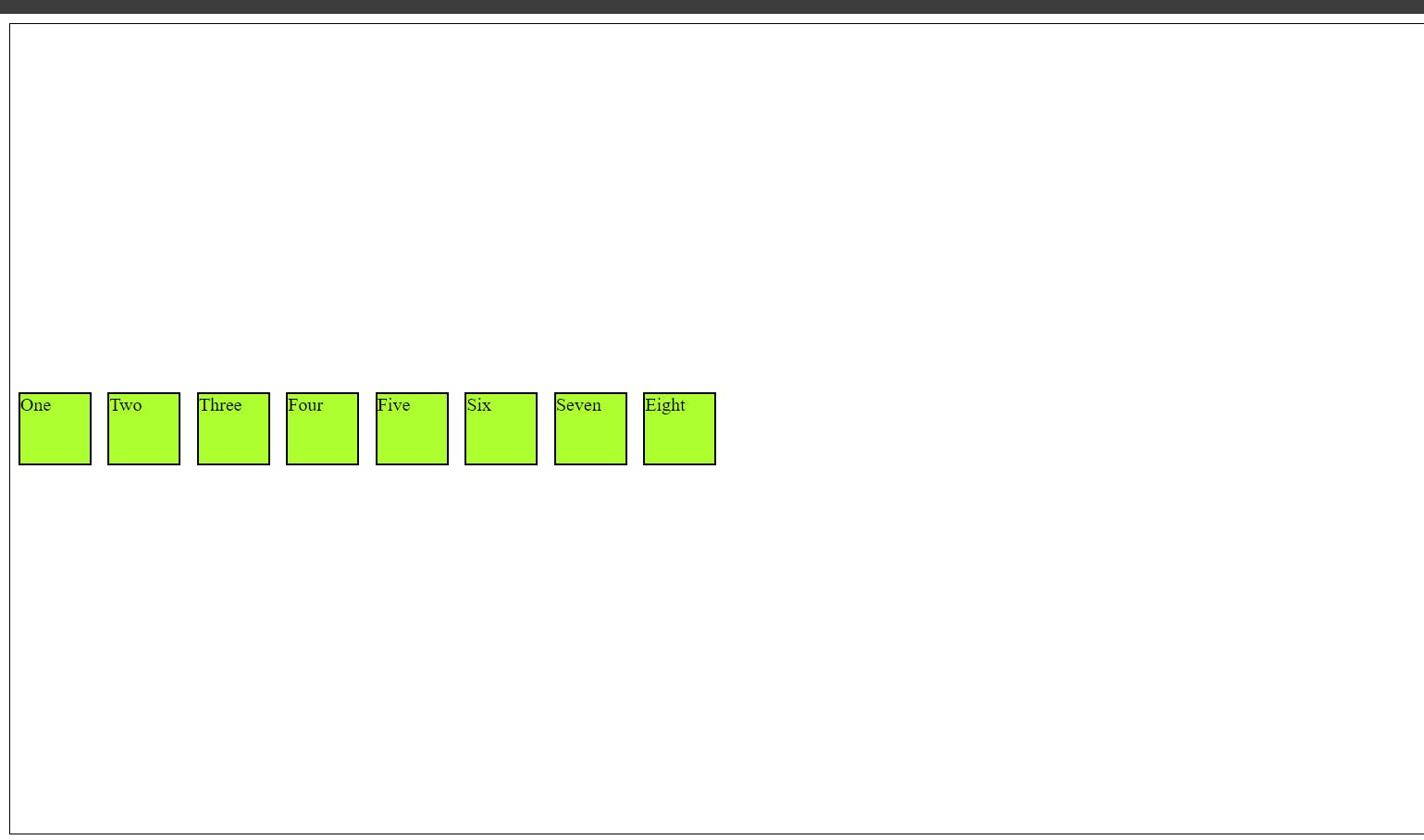
i)flex-start
Items are aligned to the start of the cross-axis.
.Container{
display: flex;
height: 700px;
border: 1px solid black;
 align-items: flex-start;
}
Output:

ii)Flex-end
Items are aligned to the end of the cross-axis .This means the items will be aligned at the bottom of the container, and in a column layout, it means the items will be aligned at the right side of the container.
.Container{
display: flex;
height: 700px;
border: 1px solid black;
 align-items: flex-end;
}
Output:

iii)Flex-center
It means that the items inside the container will be centered along the cross-axis.
.Container{
display: flex;
height: 700px;
border: 1px solid black;
 align-items: center;
}
Output:
iv) flex Stretch
It means that the items within the flex container will be stretched along the cross-axis to fill the entire container. This stretching effect is applied to each item individually .While using this property we should avoid giving height and width to the items.
.Container{
display: flex;
height: 700px;
border: 1px solid black;
 align-items: stretch;
}
Output:
v) Flex baseline
It is used to define how flex items are aligned along the cross-axis of the flex container. The baseline value for the align-items property aligns the baselines of the flex items.
7)Gap, row-gap, column-gap:
It is used for setting the gap between rows and columns in a grid or between flex items in a flex container.
.Container{
display: flex;
height: 700px;
border: 1px solid black;
 gap: 90px
}
The row-gap property is used to set the gap between rows in a grid or between flex items along the cross-axis in a flex container.
.Container{
display: flex;
height: 700px;
border: 1px solid black;
 row-gap: 90px
}
The column-gap property is used to set the gap between columns in a grid or between flex items along the main axis in a flex container.
.Container{
display: flex;
height: 700px;
border: 1px solid black;
 column-gap: 90px
}
You can go through the below code for reference
<!DOCTYPE html>
<html lang="en">

<head>
  <meta charset="UTF-8">
  <meta name="viewport" content="width=device-width, initial-scale=1.0">
  <title>Flex</title>
  <style>
    .Container {
      display: flex;
      height: 700px;
      border: 1px solid black;


      /* flex-direction: column; */
      /* flex-direction: column-reverse; */
      /* flex-direction: row; */
      /* flex-direction: row-reverse; */


      /* flex-wrap: nowrap; */
      /* flex-wrap: wrap-reverse; */


      /* flex-flow: column wrap; */


      /* justify-content: center; */
      /* justify-content: flex-start; */
      /* justify-content: flex-end; */
      /* justify-content: space-around; */
      /* justify-content: space-between; */
      /* justify-content: space-evenly; */
      /* justify-content: right; */
      /* justify-content: left; */


      /* align-items: start; */
      /* align-items: end;   */
      /* align-items: center; */
      /* align-items: stretch; */
      /* align-items: last baseline ; */


      /* align-content: flex-start; */
      /* align-content: flex-end; */
      /* align-content: center; */
      /* align-content: stretch; */
      /* align-content: baseline; */


      /* justify-content:flex-start;
      justify-content:flex-end;
      justify-content:center;
      justify-content:space-between;
      justify-content:space-evenly; */

       /* align-items: start; */
       /* align-items: end; */
       /* align-items: center; */
      /* align-items: stretch; */
        /* align-items: baseline; */
         /* gap: 90px;  */
         row-gap: 200px;
    }

    .Item {
      border: 2px solid black;
      background-color: greenyellow;
      /* margin: 7px; */
      /* padding: 7px; */
      /* height: 60px;
      width: 60px;
      flex-shrink: 4; */

    }


    /* #flex {
      flex-grow: 3;
    } */
  </style>
</head>

<body>
  <div class="Container">
    <div class="Item">One</div>
    <div class="Item" id="flex">Two</div>
    <div class="Item">Three</div>
    <div class="Item">Four</div>
    <div class="Item">Five</div>
    <div class="Item">Six</div>
    <div class="Item">Seven</div>
    <div class="Item">Eight</div>
  </div>
</body>

</html>
Thank you all for taking the time to delve into the details of Flexbox. Your interest and engagement mean a lot, and I appreciate your commitment to staying informed. Cheers!!!!