


Table of contents
Need of position in CSS
You know how when you're designing a webpage, sometimes you want things to be exactly where you want them, right? Like, maybe you want a button to sit right next to some text, or you want a pop-up to appear exactly in the middle of the screen. That's where the position property in CSS comes in handy!
Basically, it gives you the power to control where elements show up on your webpage. You can either position them relative to where they would normally sit in the flow of the document, or you can position them relative to other elements.
There are five different position values:
1)static
2)relative
3)fixed
4)absolute
5)sticky
let's understand one by one
common example for all the values
<!DOCTYPE html>
<html lang="en">
<head>
 <meta charset="UTF-8">
 <meta name="viewport" content="width=device-width, initial-scale=1.0">
 <title>Positions</title>

<style>
 .container {
    width: 400px;
    height: 400px;
    border: 1px solid black;
    position: relative; /* Setting the container as relative to serve as a reference for absolute positioning */
  }

  .boxes {
    display: flex;
    flex-wrap: wrap;
  }

  .box {
    width: 100px;
    height: 100px;
    background-color: black;
    color: white;
    text-align: center;
    line-height: 100px;
    margin: 10px;
  }
</style>
</head>
<body>
 <div class="container">
  <div class="boxes">
  <div class="box">box1</div>
  <div class="box">box2</div>
  <div class="box">box3</div>
  <div class="box">box4</div>
  <div class="box">box5</div>
 </div>
 </div>
</body>
</html>

1) Static Positioning:
When an element is set to position: static, it just chills where it naturally belongs in the document flow. You don't need to do anything special; it's like going with the flow of the river. The browser figures out where to put it based on the HTML structure and other styling.
example
.box:nth-child(1) {
position: static;
background-color: blanchedalmond;
color: black;
}

as we can see we have given static position to first child but as mentioned its the going to natural position so there won't be any changes in the position of the first child.
2)relative
When you set an element's position to relative in CSS, it's essentially telling the browser, "Hey, I'm cool with this element hanging out where it naturally belongs in the flow of the webpage, but let's tweak its position a bit."
Using properties like top, right, bottom, and left, you can give this element a gentle nudge from its original position. It's like saying, "Hey, move this button a tad lower," or "Let's shift this box slightly to the right."
The neat thing is, even though you're moving it, the space it originally occupied remains reserved. So, other elements on the page won't get shuffled around unexpectedly. They'll carry on as if the element stayed put, maintaining the layout's stability.
example
box:nth-child(2) {
   position: relative;
   background-color: brown;
   top:30px;
   left: 30px;
  }
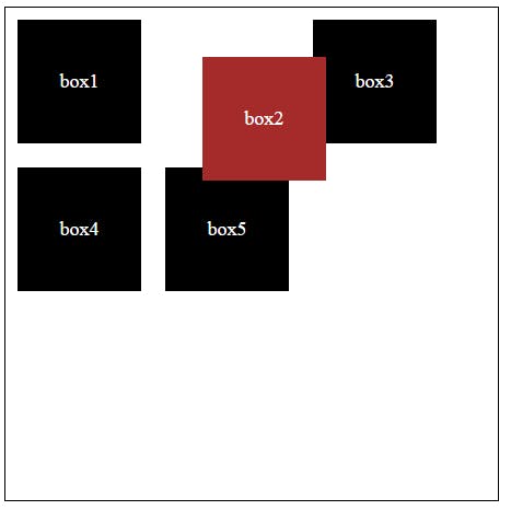
we have given relative position to second child although it's position has been changed according to coordinates we have give but it's original position is staying same no other element has taken it's place.
3)fixed
When you set an element's position to fixed in CSS, it's like instructing the browser, "Keep this element locked in its current position on the screen, regardless of scrolling."
This positioning makes it handy for elements you want to remain visible at all times, like a navigation bar or a call-to-action button. They stay in the same spot, even as users scroll through your content.
Similar to absolutely positioned elements, fixed elements are removed from the normal document flow. They're like separate entities, not affecting the layout of other elements on the page.
box:nth-child(3) {
   position: fixed;
   top: 50px;
   right: 50px;
  }
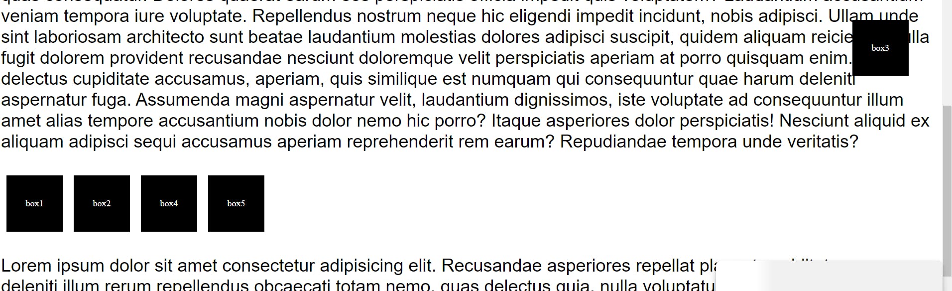
all the other boxes are at same place but third box we have give it fixed value so even if we scroll the box is still going to be there only.
4)absolute:
When you set an element's position to absolute in CSS, you're instructing the browser to position it precisely where you specify, without considering its surrounding elements.
Now, the browser needs to figure out where exactly to place this element. It first looks for the nearest ancestor element that has a position other than the default static. If it finds one, the absolutely positioned element is positioned relative to that ancestor. If not, it's positioned relative to the initial containing block, which is usually the <html> element.
Since absolutely positioned elements are taken out of the normal document flow, they don't affect the position of other elements. This means they can overlap with other content or leave gaps in the layout without disrupting the flow of the page.
.box:nth-child(4) {
   position: absolute;
   top: 80px;
   left: 60px;
  }

5)sticky
When you set an element's position to sticky in CSS, you're essentially saying, "Hey browser, I want this element to stick around, but only after a certain point."
Here's the scoop: Initially, it behaves like any other element with relative positioning. It moves along with the page as you scroll, minding its own business.
But once you reach a specific spot on the page, it's like a switch flips, and suddenly it becomes fixed in place, not budging an inch even as you continue to scroll.
This behavior is particularly handy for things like sticky headers or sidebars that you want to stay visible as users scroll down a page. It's like having a helpful assistant that knows exactly when to step in and stay put, ensuring important content remains accessible.
.box:nth-child(5) {
     position: sticky;
    top: 0;

  }

here we can see even if we scroll box 4 will at it's position whereas other boxes has been moved.
This is all about position in CSS .
Thanks a bunch for diving into this blog with me! Your interest and involvement mean the world. If this read sparked some ideas or shed light on a few things, why not spread the love? Share it with your pals who might find it handy too!
Cheers to learning and growing together!"